Texas Tacos
delicious, neighborhood staple
Texas Tacos is a restaurant that offers in-house dining and to go. As the restaurant has begun to see a rapid growth in to go orders, a big problem emerged: how can the company retain their high level of customer satisfaction while having a better and more efficient way of taking to go orders? Our main design challenge was to create an easier way for users to put in their orders by creating a streamlined online ordering system.
Users & Audience
Designing for regulars and first time patrons
In order to identify what needed to be accomplished, we started out by administering user surveys to users who recently made to go orders with Texas Tacos. After sifting through all of the responses, I was able to identify their key pain point: they wanted an easier and more streamlined way to place to go orders. In addition, they wanted a clearer way to view and select the items they would like to purchase.
With the data collected, I found that our users are young professionals working in a variety of industries. These users have a strong preference for mobile-based experiences. With the information collected, I created user personas and a journey map to gain a better understanding of who our users are and what their preferences are.
User Personas
Identifying needs and goals
Journey map
Identifying the pain points
Based on user testing, we determined where our users are becoming frustrated with the current ordering process. Confusion with the navigation and slow loading times caused the most frustration. They want a fast and streamlined experience that makes ordering their lunch or dinner a simple task.
Ideating
getting creative and choosing the best ideas
How might we develop an ordering system that users love?
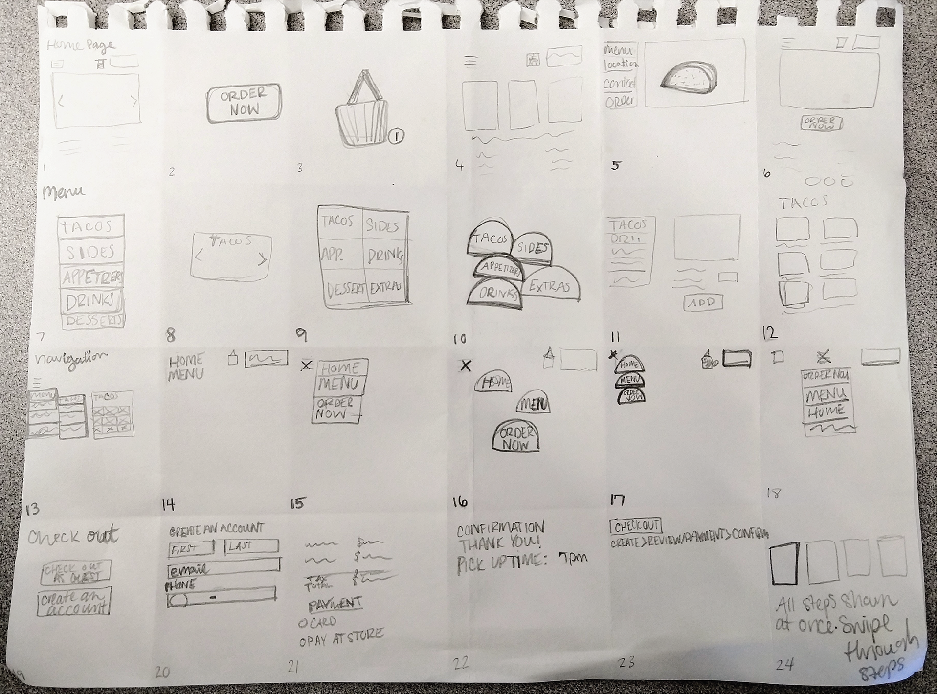
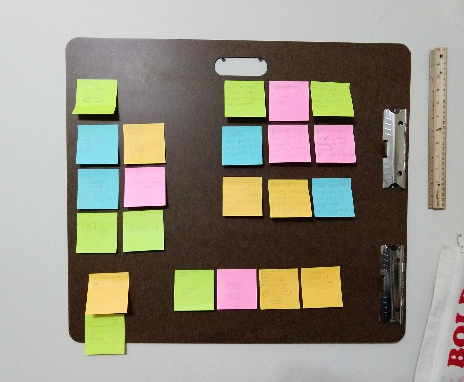
After getting to know our users, I’ve determined that what our users want most is an ordering system that is clear, fast, and easy to use. To figure out the best solutions for our problem, I decided to use the Matrix Method. After using the Matrix Method, I used an Affinity Diagram to determine which ideas would be the most effective and easily implemented. I chose my ideas and moved forward with creating a user flow and site map.


Matrix Method (left) and Affinity Diagram, in progress (right)
User flow
After choosing the best ideas, I moved forward by creating a user flow depicting the moment a user decides to order on the Texas Tacos’ website, the menu, and finally checking out and placing a order to go.
Site Map
Prototyping
Color, images, and text!
Wire Frames
After receiving some feedback on my initial sketches, I put together some wire frames before beginning work on my prototype to determine which features would be absolutely necessary.
Prototypes
Home Page
Through my research, 45% of users reported not being able to find the method of ordering to go. After two iterations of design, I found that having an order now button central on the web page was the most simple solution to direct users in the right direction for making a to go order.
Ordering menu
The ordering menu itself was an important focal point for this project. The menu before the implementation of the new system was a single PDF file. Users reported the menu file was slow to load on their phones. With the new Texas Tacos menu, users can directly order from each item page. Each item is clearly presented with price and a detailed description. Below illustrates the flow of the new menu.
Checkout
Users reported that when ordering or making reservations online it was very important for them to have a safe and easy way to check out. With the Texas Tacos’ new checkout system, users will better be able to see their exact total and opt to pay online or in store. With the use of a breadcrumb navigation bar, users can clearly see what step they are on within the check out process. They also have the option to checkout as a guest or to create an account.
Conclusion
Texas Tacos has had an increase in to go orders since the implementation of the new ordering system. They have also seen an increase in first-time customers as well.
Reflection
This project taught me the importance of considering the best and most feasible ideas. Even the simplest change or addition can make a positive difference.